 |
| Then |
 |
| Now |
Where as much thought was put into creating a signature visual for the lobby as was put into the actual movie itself, and sometimes even more so?
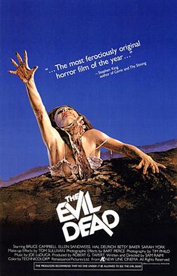
Where the poster was artwork you wanted to hang on your wall?
So glad those days are over, and that lately every poster looks the same. God knows you need that little bit of gas money it took to go down to the megaplex and NOT see a movie, but rather talk the manager into letting you have it's cool poster before they tossed it in the dumpster.
I was an obsessive collector of movie posters. In high school, I drove theater and video store bosses crazy with phone calls asking when they would be done with their displays so I could come and scavenge them. They would cover my bedroom walls, and fixtures like light switches and wall outlets would be the real bane of my existence because they meant I would either have to cut a section of the treasured poster out to make it fit, or just leave that part of the wall uncovered completely -- which would then leave the room uneven and destroy my master plan.
These posters were hung with staunch discrimination. They weren't just reminders of what I liked; they were thumb-tacked declarations of my personality. Each one had a unique attitude, and it would become such that if I laid on my bed and stared at that Drew Struzan airbrushed "Back to the Future" one-sheet long enough, I would affect that attitude -- all cavalier and Marty McFly-cool.
I'm not sure when exactly movie posters became more generic than the bottom shelf of a cereal aisle. It likely had something to do with computers, and how you could suddenly take a bunch of press photos of the cast and merge them together onto a black background, as was the case with the horror re-craze of the late '90s. Or maybe it was the ubiquitous marketing exploits of the studios, where they no longer had to just rely on the eye-catching WOW! factor of the poster to sell their product; hash-tags suddenly had more clout, and folks would now cattle herd to an actor's movie just so they could kiss his ass later on an AMA forum. More than anything, I'm sure posters lost their importance when budgets skyrocketed in the post-"Titanic" years, and whereas the hyperbole of the posters used to overwork your imagination, filmmakers could suddenly deliver with a few million measly dollars special effects that would dwarf your expectations.
 |
| "The 90s", in pictures |
Considering all this, it's really a wonder the movie poster survives. With everything we're fed about a flick up to the day it opens, do we need still life on the wall telling us what we already know? Think about "Batman vs. Superman", for example, that -- even though the movie itself is more than a year away from opening -- already has a "teaser" trailer that's three minutes long, and all-but-reveals who wins the fight (hint: it's probably the guy who's immortal!!!). And that "Suicide Squad" movie continues to "leak" so many photos of actual film footage that by the day it opens you'll probably be able to piece them all together into a flip-book and save fifteen bucks. Yep, it really seems that the movie poster is just a stalwart of film industry bureaucracy, something that's done just because it's always been done and without much thought to why it's even done in the first place.
Now, with original poster art flat-lining, what we have left is an endless run of amateur Photoshop. Sure, you can make the argument that there are and have always been six basic poster designs, but what we have now are the laziest in history. They are the artistic equivalent of Ramen Noodles, and if I were still that teenager collecting these posters in high school, my wall would look like a smattering of collectible plastic cups from McDonald's.
The best of the worst would have to go to every poster that simply has words over a face. Like all lazy trends, it started lofty, with the iconic poster for "The Social Network". The words over the actor's face were simple and bold, and reflected the zeitgeist of social media. To anyone who liked the movie, that poster meant something; like the artwork on my bedroom walls, it was an attitude. But sure enough, what producers saw was the chance to make bank with off-the-shelf photo software. Heck, they could hire their kids! It'll bring the family together.
 |
| "Son, how'd you like to do the poster for my movie?" |
Over the last few years, there have been so many movies -- good and bad -- to utilize this words-slapped-on-a-face formula that it has come to damn sure symbolize apathy in the film industry.

My favorite -- one that almost works as a great piece of satire, if they intended it that way:
Oops, they forgot a step!
 |
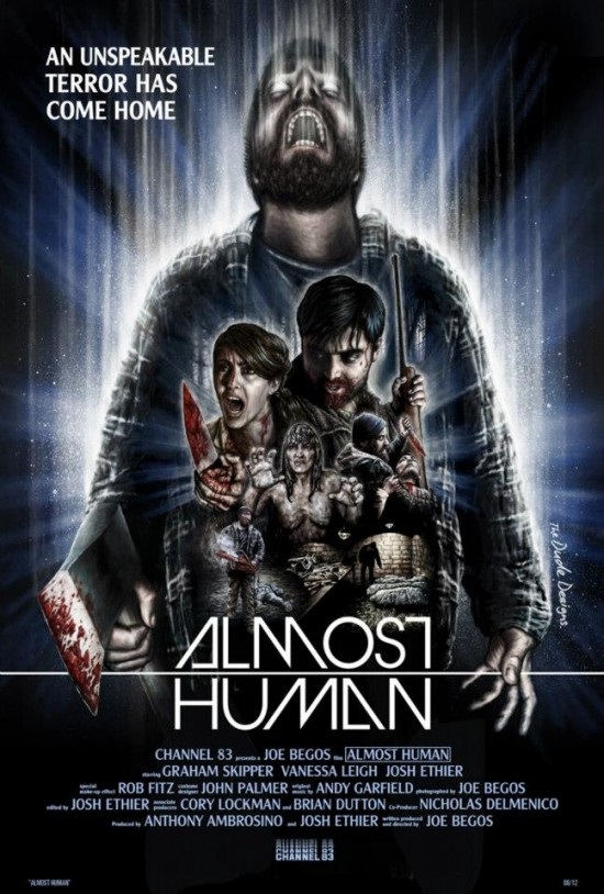
 Of course I'm not the only one to notice and spout off about this; the Internet is littered with frustrated bloggers eating Fritos and lamenting about the lack of work ethic in movies. In fact, the bitching seems to be so loud that a response has finally come....mostly from the independent film industry. This movement of throwback, grassroots cinefile activists seems to be comprised mostly of young filmmakers who, like me, grew up with artwork eating their bedrooms; 80s airbrush- renaissance fair like "John Carpenter's The Thing" and "Raiders of the Lost Arc" ate cereal with them in the morning and watched them study biology at night. Now that these kids are older and have investors, they aren't forgetting what the classic poster illustration can add to the experience of the movie itself. Of course the real shame in this is that so many of these auteurs are so focused on honoring their wallpaper heroes that they forget to create a style of their own. But that's another blog.
I've tried hard to get through this whole blog without tooling the words "In my day..."; mostly, my day was the 90s, when poster art was not really that much better than it is now (just look at any Harrison Ford pic between "Patriot Games" and "Air Force One"). But there was still a competition for your attention going on that just doesn't exist anymore. Think about the video store. Sometimes, you'd go straight to the New Release wall and take what you came for. But what if all fifty copies were gone, and you had to resort to the vault of backlog horrors? When you didn't have your smart phone and you couldn't go home and just stream something, all you had to go on was the artwork; it brought natural selection to your pop culture sensibilities.
 |
| Good God, that's beautiful! |
The creative well has been dry in movies for a long time, but the funny thing is that no one seems to be mourning it too much. With instant digital access to knowledge and real-time gratification of media, it's not just the movie posters that're irrelevant, but the industry in general. Not to mention that television -- for the first-time ever -- is way better than almost anything we can see in a theater. Now, we seem to only flock to sit in dark rooms with each other when we're killing time between seasons of "House of Cards."
So that's all I can figure at this time. We tolerate movies as placeholders. They don't have to be inventive, stunning, or include mind-blowing ideas anymore. Their posters can all be the same -- WE DON'T CARE! Just as long as we can click on them and stream the damn flick instantly. It's like comparing a Golden Book to Thomas Pynchon. Movies are real kid stuff, with their cutesy, 1-D characters and shallow plots, while television is dense, literary, rebellious and unapologetically original.
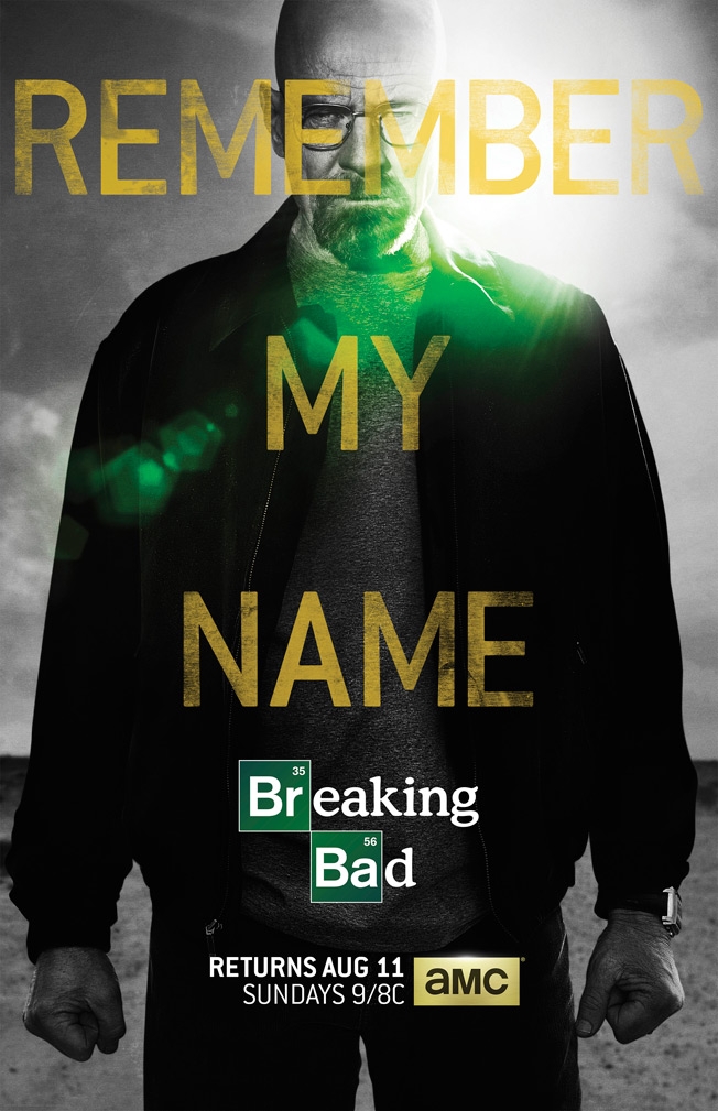
Oh damn it. Et tu, "Breaking Bad"?


No comments:
Post a Comment